Corporate Identity + Packaging
Melina’s
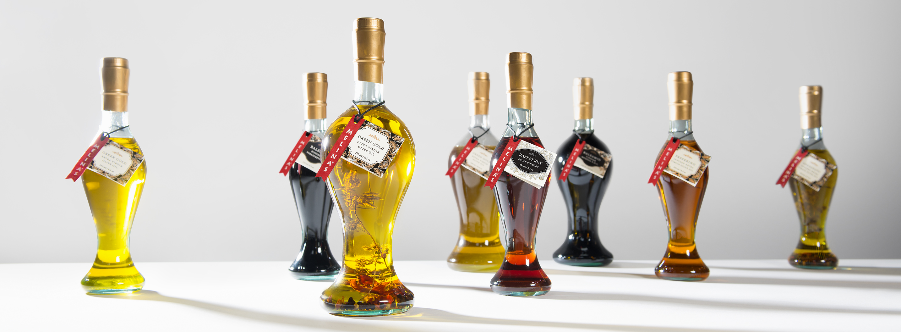
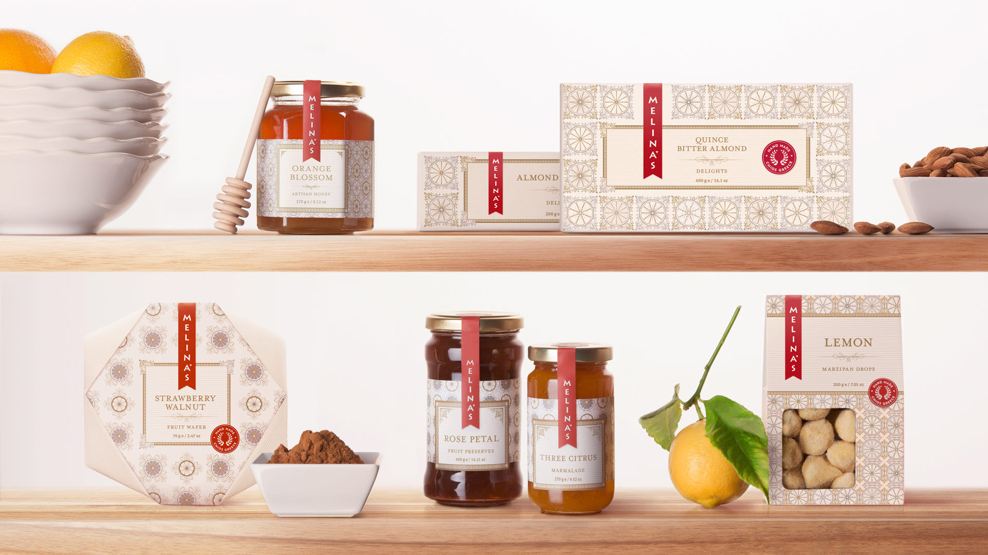
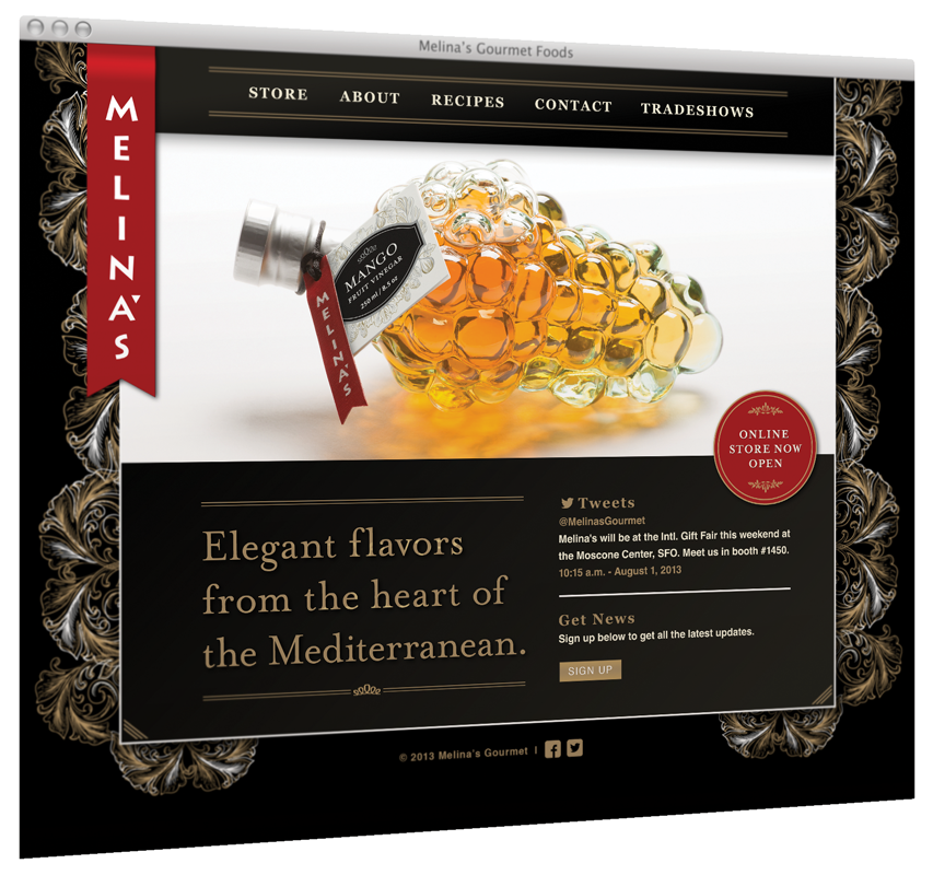
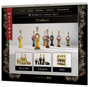
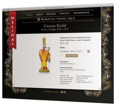
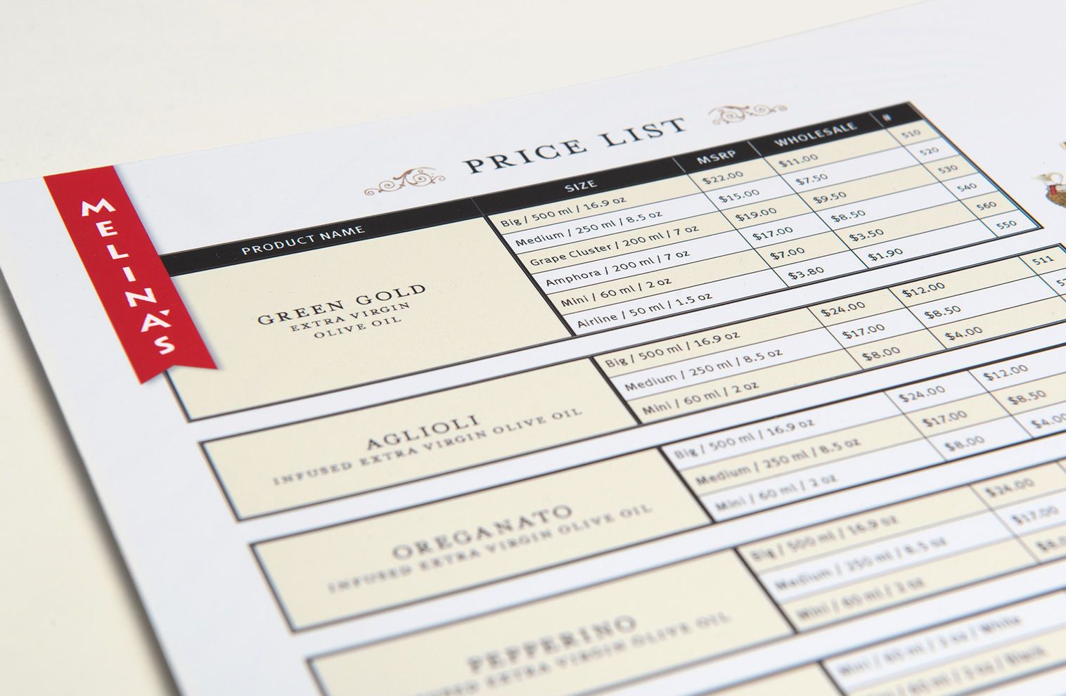
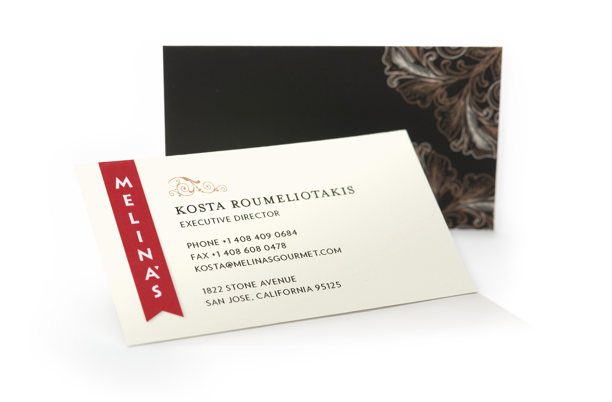
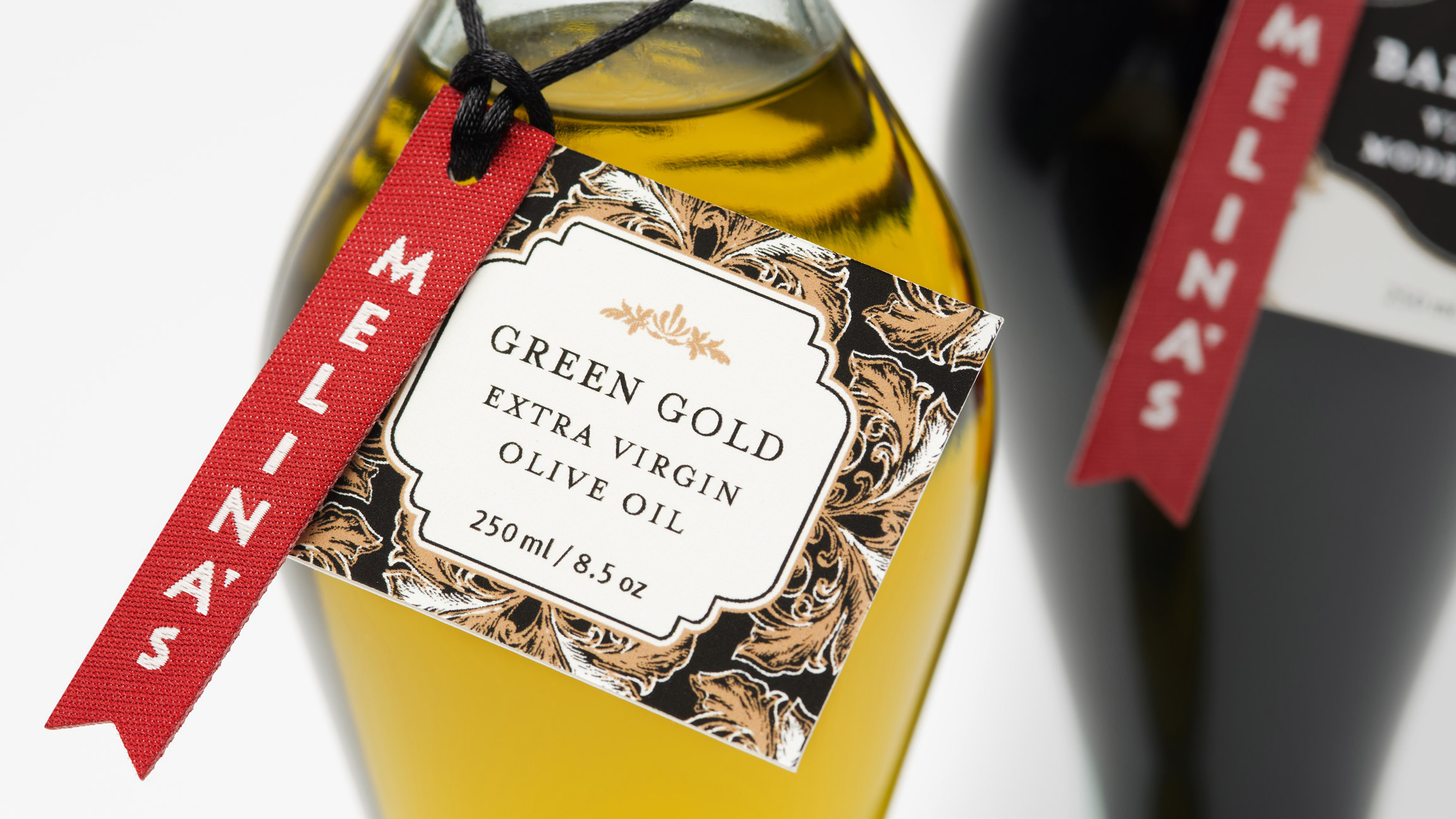
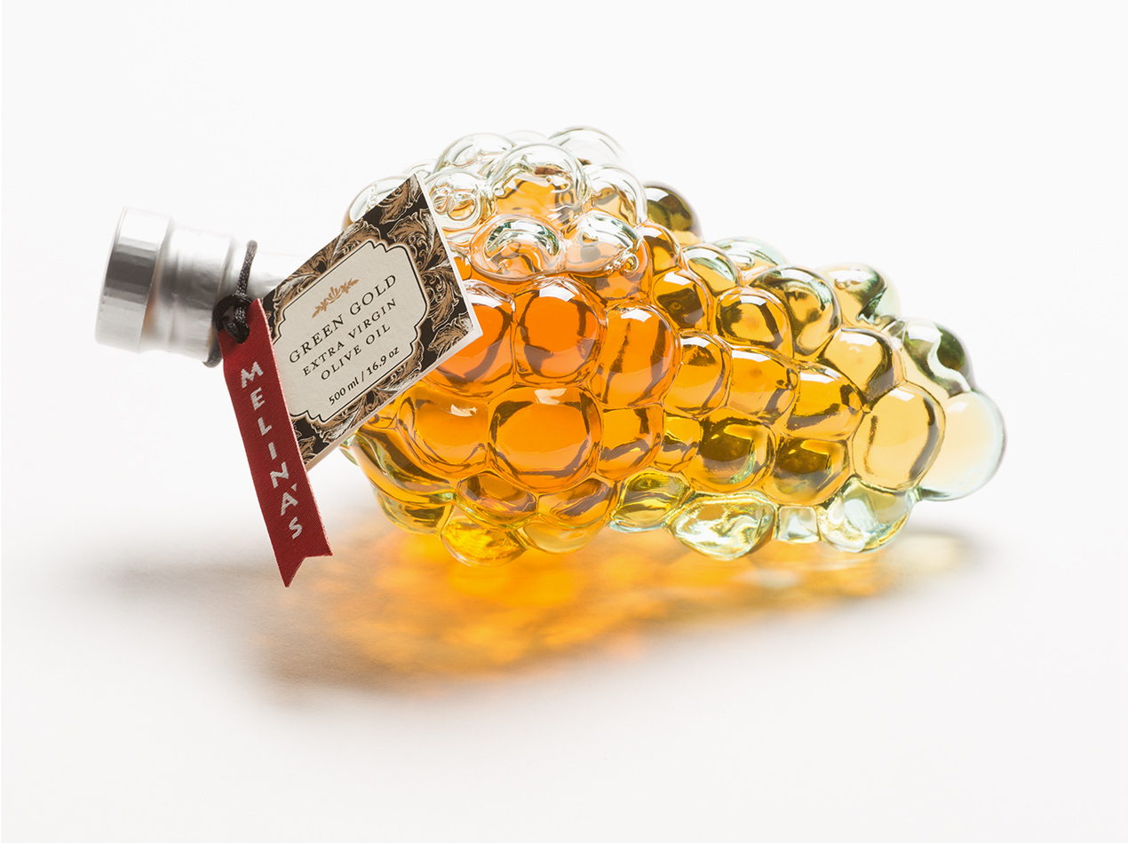
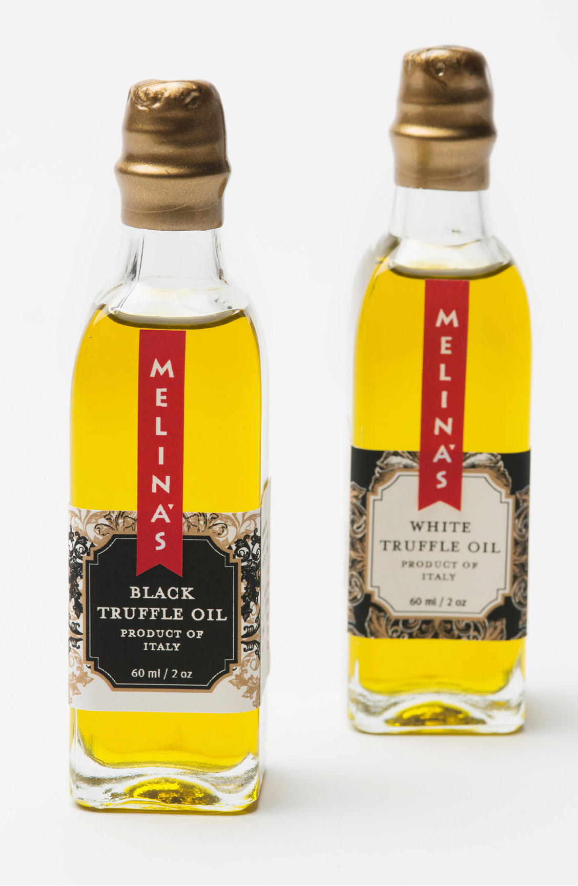
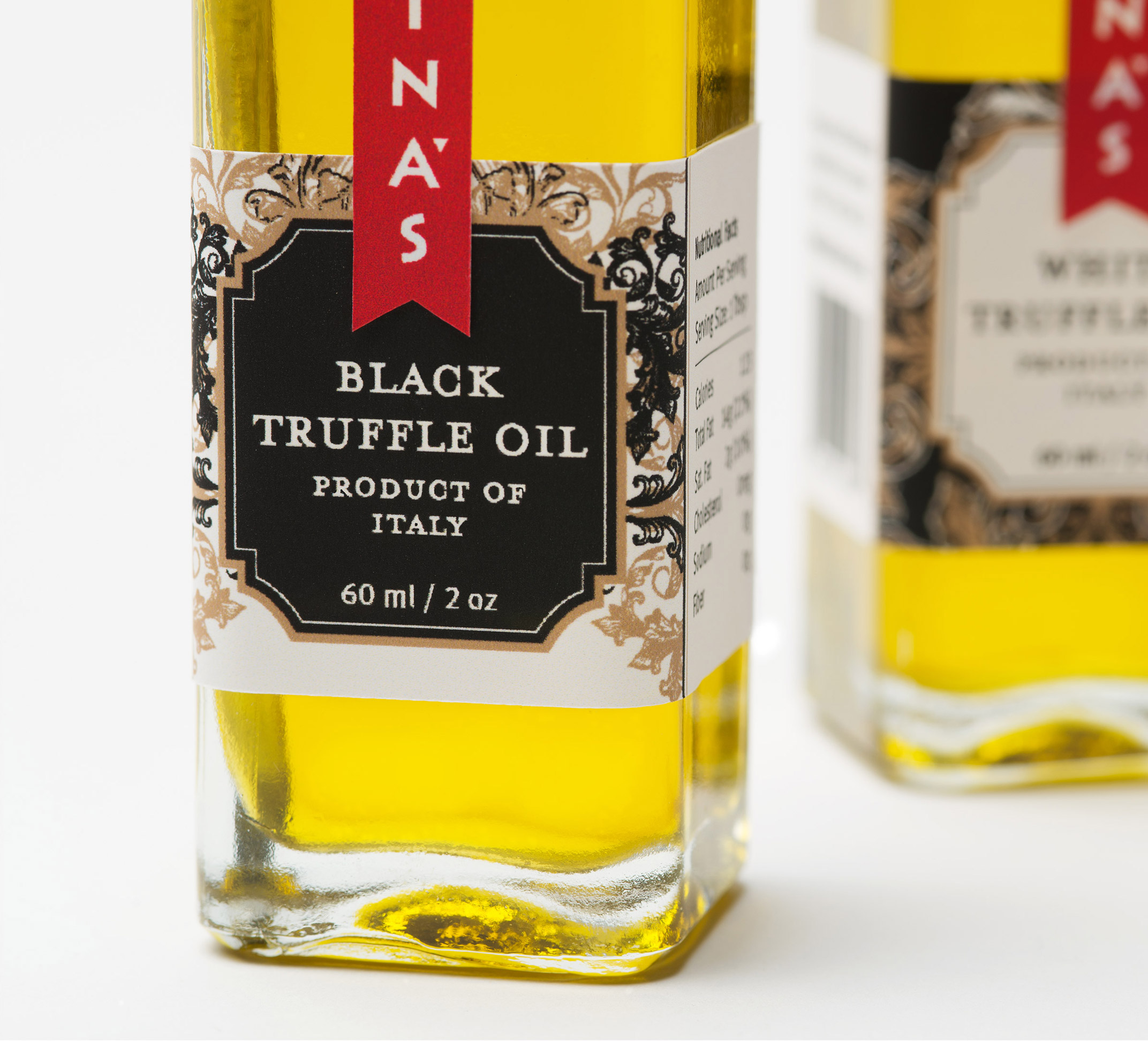
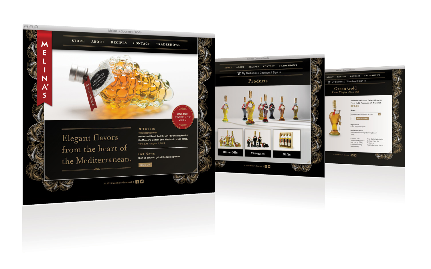
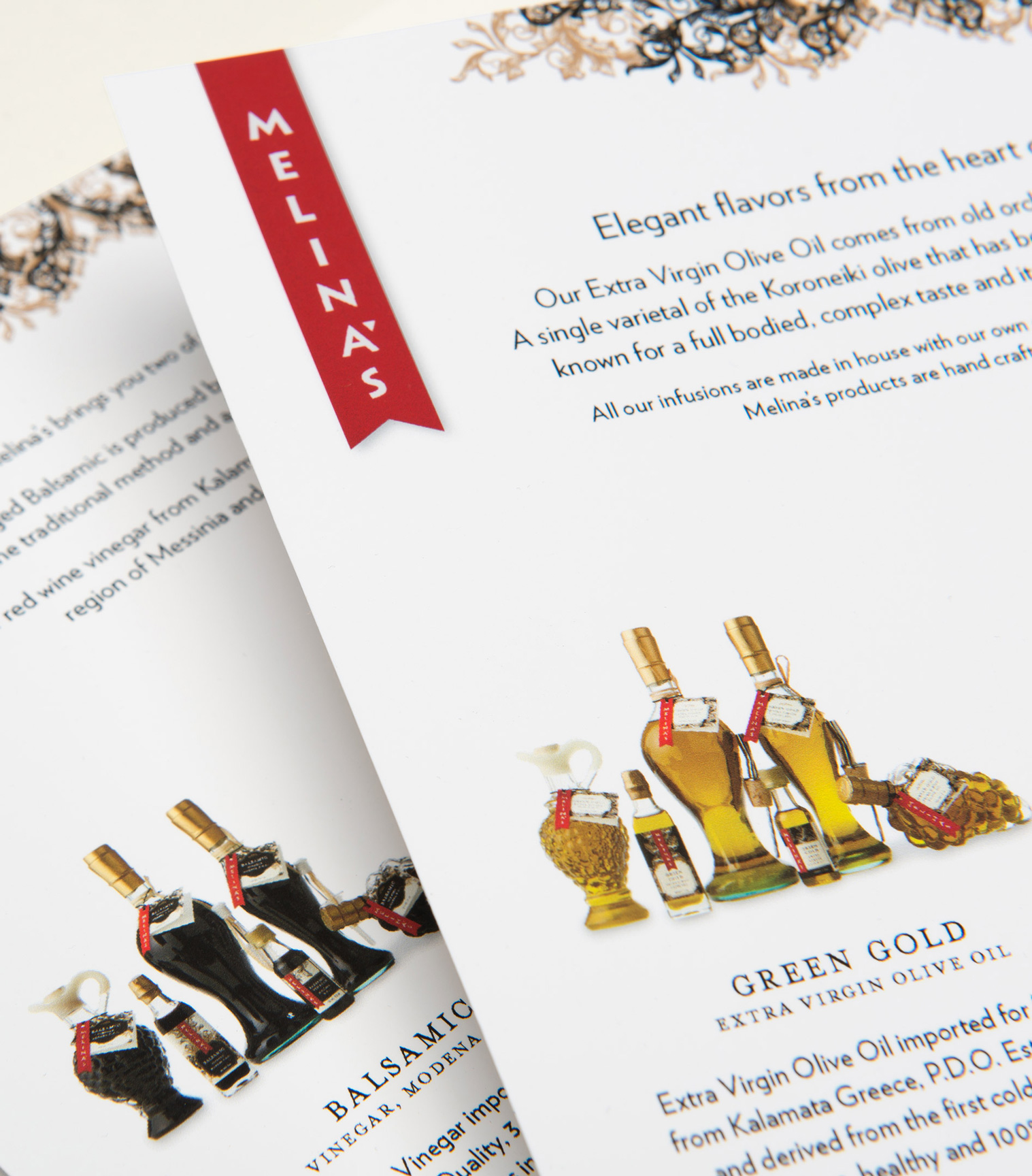
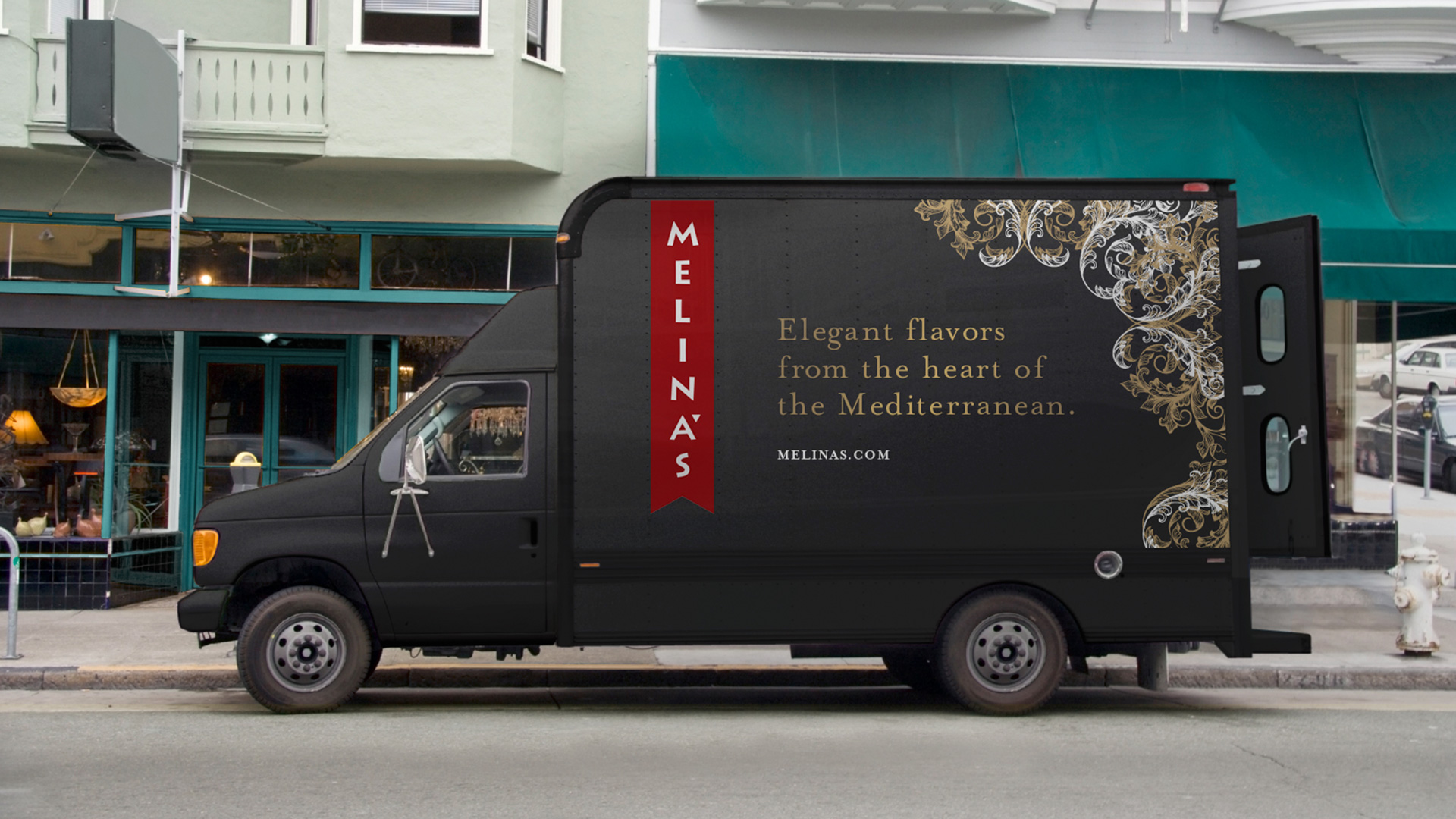
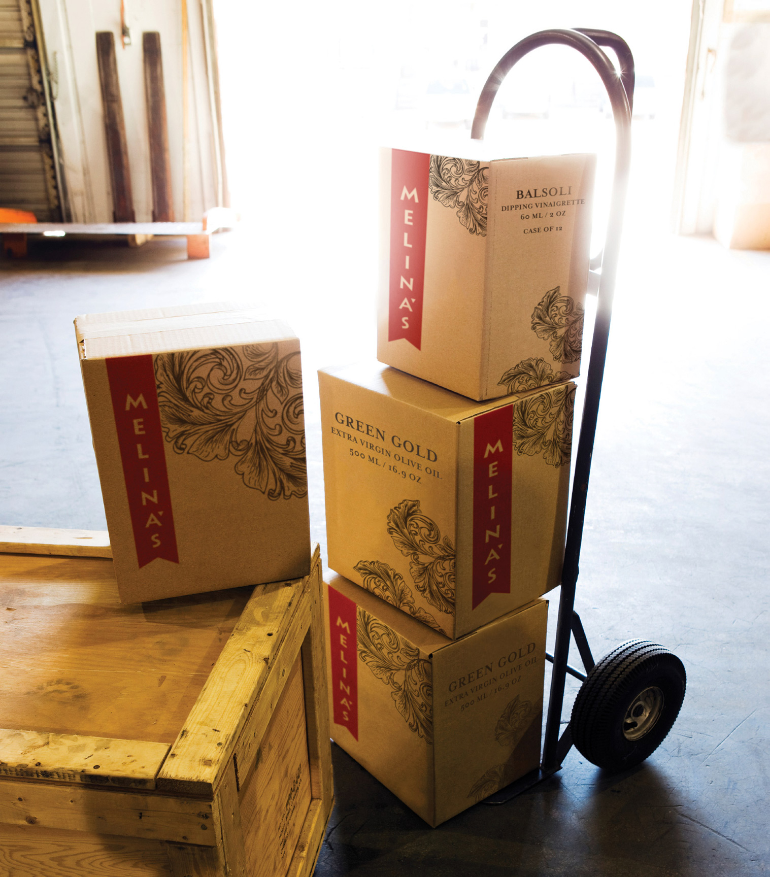
Melina’s is a line of gourmet foods originating in the Mediterranean. As a small startup in a very competitive field, we wanted to set Melina’s apart with branding that would appeal to their clientele of food connoisseurs and stand out on the shelf. From the choice of typeface, to the traditional bottles, to the red award ribbon that ties the entire line together, we sought to hint at the Greek heritage of Melina’s founder and convey the very high quality of the products they offer.






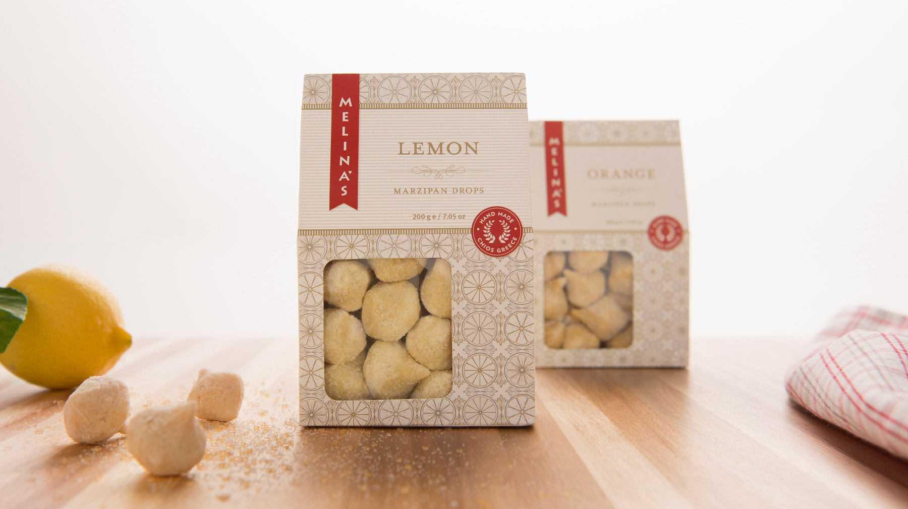
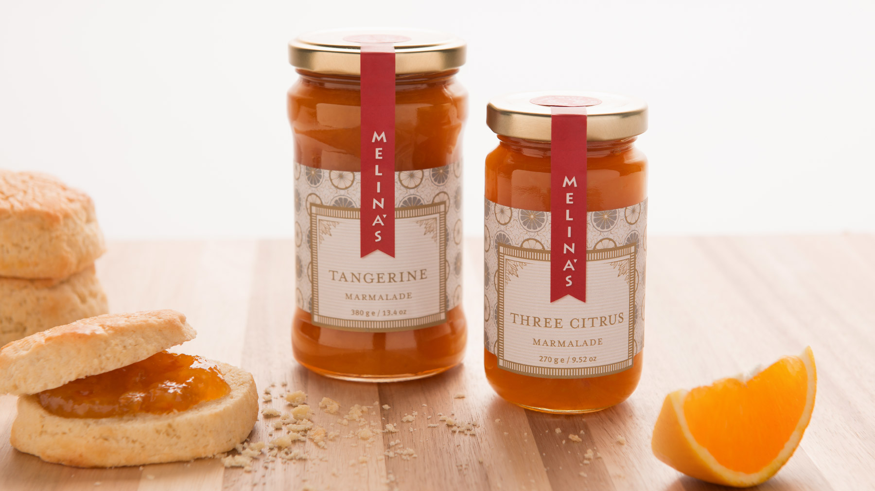
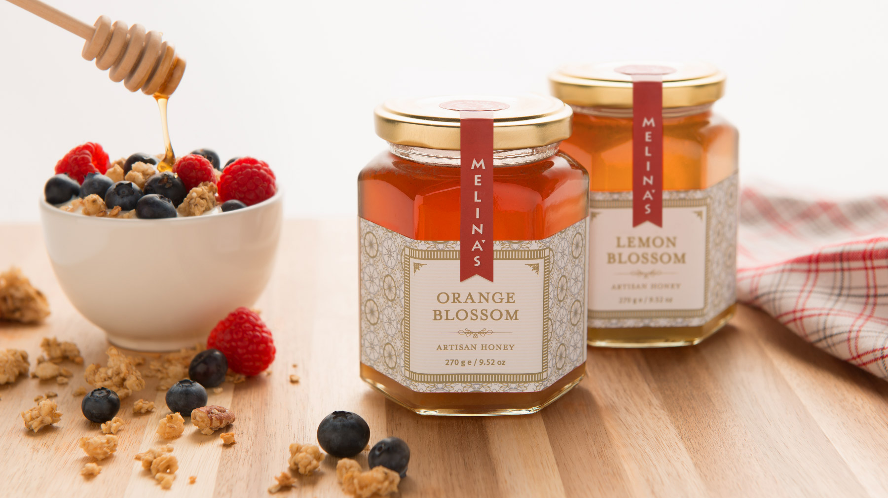
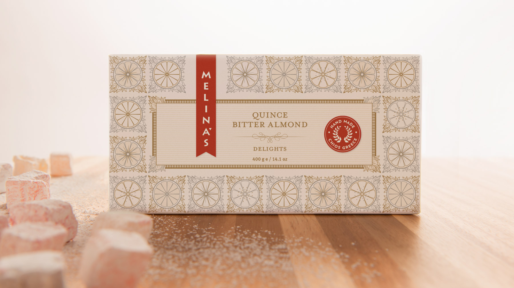
Melina’s sweet line of citrus confections included marmalade, jam, fruit preserves, honey, marzipan drops, fruit wafers, and delights. Everything was made from all natural and premium ingredients harvested on small farms in the sunny Kambos region of the Greek Island of Chios. For the packaging, we drew our inspiration from vintage labels and exotic motifs, with elegant typography and a subtle color palette to keep things contemporary.








Melina’s sweet line of citrus confections included marmalade, jam, fruit preserves, honey, marzipan drops, fruit wafers, and delights. Everything was made from all natural and premium ingredients harvested on small farms in the sunny Kambos region of the Greek Island of Chios. For the packaging, we drew our inspiration from vintage labels and exotic motifs, with elegant typography and a subtle color palette to keep things contemporary.
